Creating Custom Date Selectors in Oracle APEX: Month, Quarter, and Year
Introduction
Ever craved more control over date pickers in your Oracle APEX applications? The buit-in options might not always offer the perfect fit. This post explores a technique to create custom date selectors for specific needs:
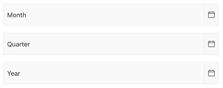
- Month Selector -> choose just month and year
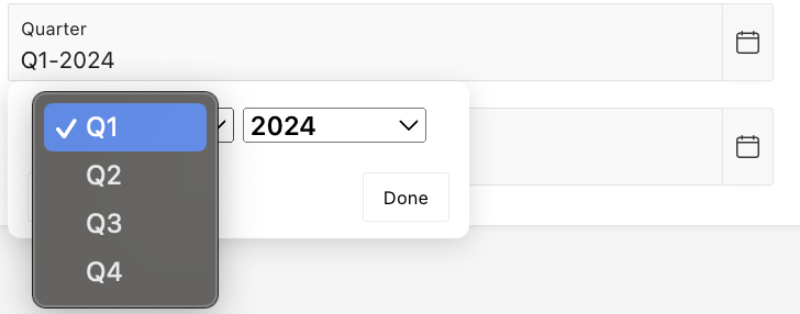
- Quarter Selector -> select quarter and year
- Year Selector -> pick only the year

Crafting Custom Selectors:
Create Text Fields:
- We'll create three page items of type Text Field : P2_MONTH, P2_QTR and P2_YEAR
- We'll leverage jQuery to dynamically add calendar buttons next to each text field. These buttons trigger the datepicker functionality.
- In the Post Text attribute of each item, add the following code:
- For P2_MONTH
<button
type="button"
style="height:100%"
class="a-Button a-Button--calendar"
onclick="$('#P2_MONTH').datepicker('show');">
<span class="a-Icon icon-calendar" >
</span>
</button>
- For P2_QTR
<button
type="button"
style="height:100%"
class="a-Button a-Button--calendar"
onclick="$('#P2_QTR').datepicker('show');">
<span class="a-Icon icon-calendar" >
</span>
</button>
- For P2_YEAR
<button
type="button"
style="height:100%"
class="a-Button a-Button--calendar"
onclick="$('#P2_YEAR').datepicker('show');">
<span class="a-Icon icon-calendar" >
</span>
</button>
Configure Datepickers (JavaScript):
- JavaScript is used to configure individual datepicker behaviours for each fields.
- Navigate to Page Attributes and add the following code to the Execute when page loads section
$('#P2_MONTH').datepicker({
changeMonth: true,
changeYear: true,
showButtonPanel: true,
dateFormat: 'yy-mm',
yearRange: '2020:2030',
onClose: function(dateText, inst) {
var month = $("#ui-datepicker-div .ui-datepicker-month :selected").val();
var year = $("#ui-datepicker-div .ui-datepicker-year :selected").val();
$(this).datepicker('setDate', new Date(year, month, 1));
},
beforeShow: function(input, inst) {
var datestr;
if ((datestr = $(this).val()).length > 0) {
year = datestr.substring(0, 4);
month = datestr.substring(5, 7);
$(this).datepicker('option', 'defaultDate', new Date(year, month - 1, 1));
$(this).datepicker('setDate', new Date(year, month - 1, 1));
$(".ui-datepicker-calendar").hide();
}
}
});
$('#P2_QTR').datepicker({
dateFormat: 'M-yy',
changeMonth: true,
changeYear: true,
showButtonPanel: true,
yearRange: '2020:2030',
monthNamesShort: ["", "", "Q1", "", "", "Q2", "", "", "Q3", "", "", "Q4"],
onClose: function(dateText, inst) {
var month = $("#ui-datepicker-div .ui-datepicker-month :selected").val();
var year = $("#ui-datepicker-div .ui-datepicker-year :selected").val();
$(this).datepicker('setDate', new Date(year, month, 1));
},
beforeShow: function(input, inst) {
var datestr;
if ((datestr = $(this).val()).length > 0) {
var year = datestr.substring(datestr.length - 4, datestr.length);
var qtr = datestr.substring(0, 2);
var month;
if (qtr == 'Q1')
month = '03';
else if (qtr == 'Q2')
month = '06';
else if (qtr == 'Q3')
month = '09';
else if (qtr == 'Q4')
month = '12';
$(this).datepicker('option', 'defaultDate', new Date(year, month - 1, 1));
$(this).datepicker('setDate', new Date(year, month - 1, 1));
$(".ui-datepicker-calendar").hide();
}
},
afterShow: function(dateText, inst) {
var keepMonths = [];
for (i = -1; i < 12; i += 3) {
keepMonths.push(i);
}
$(".ui-datepicker-month option").each(function() {
if ($.inArray(parseInt(this.value), keepMonths) < 0) {
$(this).remove();
}
});
}
}).next('button').text('Show calendar').button({
icons: {
primary: 'ui-icon-calendar'
},
text: false
});
$.datepicker._updateDatepicker_original = $.datepicker._updateDatepicker;
$.datepicker._updateDatepicker = function(inst) {
$.datepicker._updateDatepicker_original(inst);
var afterShow = this._get(inst, 'afterShow');
if (afterShow)
afterShow.apply((inst.input ? inst.input[0] : null));
}
$('#P2_YEAR').datepicker({
changeYear: true,
showButtonPanel: true,
dateFormat: 'yy',
yearRange: '2020:2030',
onClose: function(dateText, inst) {
var year = $("#ui-datepicker-div .ui-datepicker-year :selected").val();
$(this).datepicker('setDate', new Date(year, 1));
},
beforeShow: function(input, inst) {
var datestr;
if ((datestr = $(this).val()).length > 0) {
year = datestr
$(this).datepicker('option', 'defaultDate', new Date(year, 1));
$(this).datepicker('setDate', new Date(year, 1));
$(".ui-datepicker-calendar").hide();
$(".ui-datepicker-month").hide();
}
},
afterShow: function(dateText, inst) {
$(".ui-datepicker-month").hide();
}
});
Style Enhancements(CSS):
- Add the following CSS to the Inline CSS attribute of the page
.ui-datepicker-calendar,
.ui-datepicker-next,
.ui-datepicker-prev {
display: none;
}
The Final Result:
- Here is how the custom date selectors look when the page is run.


This approach provides a solid starting point for further customisation.
This Post reflects the learning and experience I gained from working on various projects alongside my talented team members.
